

7 Things to Do This Week to Take Your Substack to the Next Level
Seven things you need to nail down to build and grow a successful Substack.

I’ve heard from a lot of people lately who either want to start their Substack and don’t know how best to begin, or who have been posting to Substack and achieved some success, but want to really hone in on their paid offerings and figure out how to take their publication to the next level.
If you didn’t know, I have a background in branding and strategy – I’ve spent over a decade helping brands, businesses, and solopreneurs of all stripes to hone in on their messaging, audience, and visuals to take their business to a new level.
So, naturally, I have some thoughts about branding and positioning your Substack, and I’m gonna share because I want to make the internet a more lovely and strategically branded place.
1. Nail down your strategy and positioning.
Before you publish your first (or next) post, you need to get super clear on three things: who you are, who you write for, and why you’re different than all the other Substack newsletters out there.
Positioning
This is the single most important sentence you’ll write. It answers three things at once: what this publication is about, who it’s for, and what makes it different from every other newsletter in your space.
Most people answer the first question and stop. “It’s about books and slow living” is a category, not a position. A position says: here is the specific person with the specific problem that I’m here to solve.
The formula: [Publication name] is for [specific type of person] who [specific situation or struggle] – [what you help them do/feel/understand] without [what you explicitly are not].
The test: Read your positioning statement and ask – could this describe any other publication in this space? If yes, keep going.
Audience Profile
The next thing you need to know is who you’re writing for. Remember the golden rule of branding: if you’re marketing to everyone, you’re marketing to no one. Of course you want as many people as possible to read and subscribe to your Substack. But depth is always better than breadth when it comes to audiences. You need to have your positioning so locked in that your ideal reader, client, customer, whatever will read it and feel like you’re talking specifically to her and her alone.
Enter: the audience profile. This should go deeper than simple demographics (how old she is, where she lives, her level of education and household income, etc.) What you need is the inner monologue: what is she worried about, what has she already tried, what does she feel vaguely guilty about, what does she want that she can’t quite articulate?
The more specifically you can describe that person, the more she’ll feel seen when she lands on your page. And feeling seen is the thing that converts a visitor into a subscriber.
To write your audience profile, answer these five questions:
What does she want that she can’t seem to find anywhere else?
What has she already tried that hasn’t worked?
What does she feel guilty or embarrassed about that your publication quietly validates?
What does she tell herself she is, versus what does she actually do?
What would she say to a friend to describe your publication?
Your About Statement
Your About statement is not your bio. It’s not “Hi, I’m [name] and I write about [topic].” Nobody has ever subscribed to a newsletter because they were impressed by someone’s LinkedIn summary.
Your About statement is the reader’s first moment of recognition – the place where she reads something and thinks: this is for me. It starts with her, not with you.
The structure:
Name the problem or tension your reader is living (1–2 sentences)
Name what she’s tried that hasn’t worked (1 sentence)
Introduce the publication as the alternative (1–2 sentences)
Bring in your credibility – briefly, specifically, in service of her (2–3 sentences)
The invitation (1 sentence)
Fill it in:
You’ve been ________, but it keeps leaving you feeling ________. You’ve tried ________, and somehow it makes it worse.
[Publication name] is ________. Every [cadence], I [what you do] – so that ________.
I’m [name]. I [relevant credential or lived experience that earns trust on this specific topic]. I’ve spent [time] figuring out ________, and [publication name] is where I put what I’ve learned.
[Subscribe / Join / Come in]
Want more clarity about your brand strategy and positioning? Check out the Brand Clarity Workbook in our Resource Library:

2. Develop specific content pillars.
Content pillars are the categories of content you write about. For Parenthetical, mine are: Books, Creativity & Personal Branding, Personal Style, and Artful Living.
Most publications need 3-6 pillars. Fewer than three and your publication lacks range. More than six and you start to lose coherence. These will likely go hand in hand with your strategy and positioning work, but here are a few questions you can ask to help pin them down.
Answer the following questions:
What do I actually think about constantly, unprompted?
What is the specific lens through which I see all of these topics? (Your voice is usually a lens – a way of looking at things that’s yours.)
What are the problems my reader has that map to these topics?
Once you’ve come up with your content pillars, write down 3-5 post ideas for each one. If you find you’re struggling to come up with ideas for a particular content pillars, or you feel like you’re not sure which pillar a post should live under, it’s a sign that you need to think a bit harder about your content strategy.
If you want to go really in-depth on creating your ideal content strategy, there’s a replay of a popular workshop I hosted a couple years back in our Resource Library:
3. Rewrite your welcome emails.
If you’re still using Substack’s boilerplate welcome email, you’re leaving money on the table, full stop. The number one mistake I see people make with their Substacks is not personalizing that first welcome email that goes out when someone subscribes to your publication.
This is the first impression that a new subscriber gets, so it’s important to roll out the proverbial welcome mat and make them immediately feel like they’re part of something.
What a good welcome email does:
Makes the reader feel immediately like she made the right choice
Tells her specifically what she just signed up for (not vague – actual formats, actual cadence)
Introduces you in 3–4 sentences, in the same voice as your newsletter
Links to 2–3 of your best posts (not your newest – your best, the ones that most clearly demonstrate what you do)
If you have a paid tier: mentions it once, briefly, with no pressure
What to avoid:
A wall of text with no hierarchy
An overly formal or automated-sounding tone (”Thank you for subscribing to [Publication Name]!”)
Too many links or options
No personality whatsoever
Here’s a recommended structure for your welcome email:
Part 1: Welcome to the Club
Re-iterate what your publication is and who it’s for. Make them feel really seen and welcomed into a club – it’s human nature to want to be a part of something, and your newsletter is no different.
Example:
Parenthetical is a love letter to overflowing bookshelves, stylish-but-practical shoes, and the art of romanticizing your life. It’s for women who think in color palettes and reading lists, who curate their closets as meticulously as their bookshelves, and who believe a good cup of coffee deserves to be appreciated slowly.
Since you’re here, that tells me you probably have strong opinions about how your bookshelf is organized. You’ve spent real time thinking about what your personal style actually is – not what it’s supposed to be. You believe a Saturday spent reading and rearranging furniture counts as a good weekend, and you’re done apologizing for that. I’m happy to say that you’re in the right place.
Parenthetical is a publication about the art of living like yourself. Books, personal style, creative living, and the quiet work of shaping a life that actually feels like yours – not an algorithm or a Pinterest board.
Part 2: What to Expect
This is where you tell them what you write about and when they can expect to hear from you each week. If you haven’t written content series, link to the archives so they can learn more about them and do some binge-reading. And share links to some top-performing posts too.
Example:
Every Monday, Coffee Break – a weekly dispatch of things to read, ponder, and experience slowly, organized around the things that make a life feel designed rather than just lived.
Every Wednesday, a longer essay or deep dive at the intersection of books, personal style, and creative living.
Part 3: A Soft Invitation
This is where you tell them about your paid tier, if you have one. Just a simple 1-2 paragraph pitch, no sleazy sales tactics or false pressure. Just – here’s what it is, who it’s for, and what you’ll get. (Not sure on these details? We’ll talk more about that in a second).
Example:
Paid subscribers get access to The Well-Designed Life – a full curriculum that moves through six areas of your life (style, creative practice, home, work, time, relationships) and helps you shape each one into something that actually feels like you. One subscriber described it as “The Artist’s Way, but for being the artist of your own life.”
Plus you’ll get the ever-growing Resource Library, chock full of printables, workbooks, resources, tools & templates to help you build a creative brand and life.
It’s $7/month – about the same as an iced lavender latte (with oat milk!) and just as soul-nourishing.
[Subscribe Button]
This framework clearly articulates who my newsletter is for, what they can expect to see in their inbox and when, and gives a soft invitation to upgrade to the paid tier if they’re ready to go deeper. It gives your new subscribers plenty of opportunities to binge-read your content and get more acquainted with you and your publication, but doesn’t overwhelm them with options or offers.
4. Rewrite your about page.
Once you’ve nailed down your welcome email, it’s time to zhuzz up your about page. The goods news? Most of it will be copy-pasted from that welcome email, so you’ve already done the hard work.
The page will follow the same three parts as your welcome email, but here we have more room to earn trust and share your story. For the last section in your about page, you’ll add a bit about you and your story.
What to include:
The basics – your name, your location, a few things you identify as (i.e. a mother, a Pisces, a dog-lover, a home chef, etc.)
Your story: how you got here, what relevant lives experience makes you credible on this specific topic, why you’re passionate about said topic, how you came to start this newsletter, etc.
A hint of personality that mirrors the voice your newsletter is written in (ideally, yours). Try to make it a bit better than “I love coffee and my dog” because, respectfully, who doesn’t?
What to leave out:
Your entire resume or job history. Unless you write about careers and getting jobs as your entire thing, I struggle to think of a reason why your entire employment history would be relevant to a new reader.
Anything that isn’t relevant to your ideal reader. For instance, I do Pilates three times a week, used to be a barista, and married my high school sweetheart, but none of those things are particularly relevant to what I write about, so I don’t mention them in my about page.
If you struggle to write about yourself or have a hard time figuring out which parts of your story are relevant, check out our Personal Brand Messaging Toolkit in the Resource Library:

5. Clean up your visual branding.
I’m sorry to tell you this if you’ve been under the impression that Substack is only about writing – but that’s not the case anymore. Your visual brand does matter. And I find that people fall into two camps here – either they’re super excited and focus on the visuals before anything else, or they staunchly refuse to care about visuals because they’re here to be a writer.
All due respect, but they’re both wrong.
Visuals are a trust signal before they’re anything else. A reader lands on your page and makes a judgment in approximately two seconds. That judgment isn’t “this is beautiful” or “this is ugly” – it’s “this person knows what they’re doing” or “this feels unfinished.” You want the first one.
The good news: the bar is lower than you think. You don’t need to be a designer. You need to be consistent and intentional.
The single most important thing I can tell you about DIY-ing your Substack visuals: simpler is almost always better. The impulse to add more – more colors, more fonts, more decorative elements – is the thing that makes publications look amateur. Restraint is what makes them look considered.
Here are the non-negotiable visuals you need for your Substack:
A logo or wordmark.
A square icon for your publication.
A set of templates or guidelines for your post’s featured images.
2-3 brand colors to keep things consistent.
Let’s break it down.
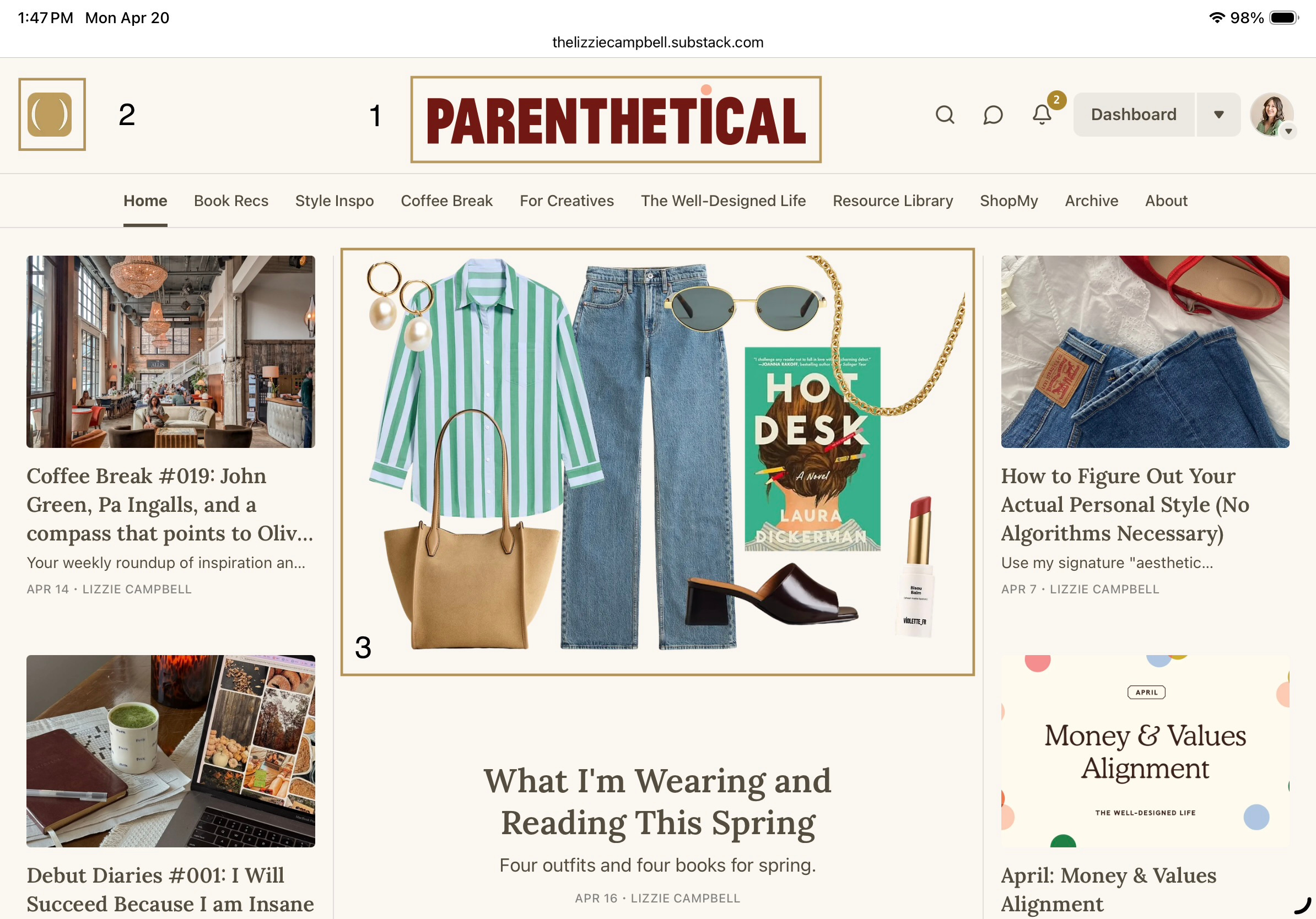
1. Logo
Size: 1344 × 256 px
Your logo or wordmark is the main identifier for your Substack. This should clearly and legibly spell out your publication’s name. When DIY-ing a logo, it’s best to keep it simple – the name spelled out in a nice font is always going to be better than something that feels super clever but is hard to read.
This needs to be a long rectangle, so don’t design it as a circle or square or else it’ll be too small to read when you upload it.
2. Icon
Size: Square, 256 × 256 px minimum
Your Substack icon is a square image – it lives in your publication navigation, in search results, and in the subscription emails people get from you. It’s small, so it needs to be simple and legible.
What works:
A simple wordmark (your publication name in a clean, readable typeface – works best for short publication names, or ones that are stackable)
A simple monogram or lettermark
A small, high-contrast illustration or icon
What doesn’t:
Anything with small details that disappear when the image is tiny
Decorative script that becomes unreadable at small sizes
Multiple colors competing for attention in a tiny square
Text surrounded by so much decorative border that the actual text is illegible
3. Featured Image
Size: 1200 × 630 px
This is the image readers see in their inbox and in the feed before they open your post. It’s your first impression, and it determines whether people click.
What works:
High-contrast photography or illustration with minimal text overlay
Consistent style across all posts (same filter, same composition style, same color treatment – so your posts are recognizable in a crowded inbox)
Images that are relevant to the actual content, not generic stock photos of “person on laptop” or “flat lay of notebook and coffee”
Simple, clean text overlay if you use text – large enough to read at thumbnail size
What doesn’t:
A different visual approach every single post (chaos in the feed, no brand recognition)
Busy, cluttered images that don’t read at thumbnail size
Text-heavy graphics where the text gets cut off on mobile
Over-designed graphics that feel like ads
The “would I recognize this in a feed” test: Put three of your post headers next to each other. Do they look like they come from the same place? They should.
4. Colors
Pick three colors. One primary (the dominant one – your brand color, the one that shows up most), one secondary (used for accents, emphasis, graphic elements), one neutral (usually a warm off-white, cream, or light gray – the background/breathing room color). That’s your brand palette.
How to pick them:
Pull from something you already love – a book cover, a painting, a photo that feels like you. Use an eyedropper tool (Canva has one) to sample exact hex codes.
Test them together before you commit. Put them next to each other in a Canva document and stare at them for a day.
Check contrast for readability. Text color over background color needs enough contrast to be easy to read – especially important for anyone reading on mobile.
What to avoid:
More than three colors in any single graphic
Neon or highly saturated colors (they read as loud and tend to age fast)
Colors that are too similar in value (they fight each other instead of creating contrast)
6. Clarify your free vs. paid offerings.
Unless you already have a huge audience, most people are not going to subscribe to your Substack for you (I say this with love).
If you intend to offer a paid tier (which I assume you are, since that’s what most people want to do with their Substack) you need to get super clear on what you’re offering – and why it’s different than what free subscribers get.
Free content should do three things: show people what you think, show them how you think, and give them a taste of what it feels like to be in your world. It should leave them wanting more – not because you’re withholding, but because there’s genuinely more to share.
Paid content should feel like access and belonging, not just more stuff. The subscriber who pays you is paying for three things: permission (to take this seriously), depth (the actual work, the tools, the curriculum), and identity (being part of an exclusive group, or being the type of person who takes this seriously).
For both free and paid tiers, answer the following:
What they get
What problem it solves
What it makes them feel
What it makes them want next
The formula: When you upgrade to paid, you get [specific thing] – which means [specific outcome or feeling] – so that [bigger picture result].
Example: When you upgrade, you get the full Well-Designed Life curriculum, with monthly workbooks and a Resource Library full of templates and tools – which means you’re actually doing the work of building a life you chose, not just reading about it – so that six months from now, your bookshelf, your wardrobe, and your daily rituals all feel like they belong to the same person.
7. Create a Notes strategy.
If you want to grow your newly strategized Substack, the BEST way to do so is to utilize Substack’s Notes feature. If you’re not aware, Substack has a built-in short form content feed called Notes, which is sort of a combination of Instagram and Twitter.
It’s got great discoverability features, and by and large, the majority of my subscribers have come from Notes. Here are the source analytics for new subscribers over the past 90 days:
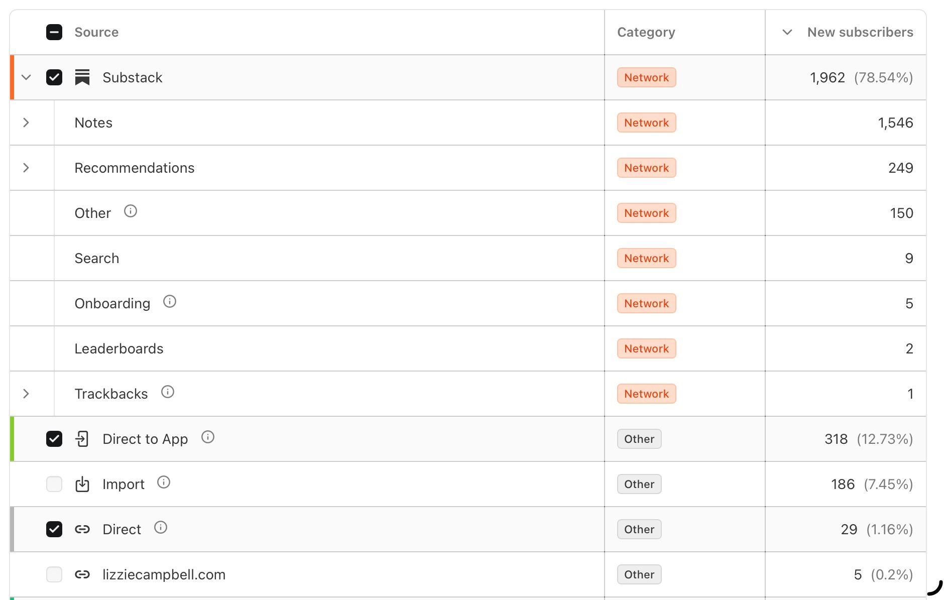
Nearly 80% of new subscribers came from Substack’s network, with the vast majority of that being from Notes. I had one note that gained me 764 new subscribers. From one Note!!!
I say all of this to tell you that Notes are huge, and if you’re not utilizing them, you’re really missing out on a massive potential growth engine. (I hated typing those words but you know what I mean).
The goods news is, you can utilize your existing content pillars that we created earlier to help you figure out what to post. From there, each Note should have one of three goals: educate, connect, or entertain.
Educate: share how to do something your audience is interested in, break it down step by step, and share a unique lens or perspective.
Connect: share more about your story, perspective, point of view, or personality.
Entertain: share something that will resonate with your audience – a meme, a funny screenshot from a show or movie, or an amusing anecdote. This is what gets shared and screenshotted.
Notes is a great place to experiment, try new types of content, and see what works. Most of your Notes will probably flop, but I have had multiple Notes get swept up by the algorithm and gain me tons of new followers and subscribers.
If you’re feeling unsure of what to post, I share a new set of content prompts each month in the Resource Library:

So there you have it! A crash course in resurrecting or revamping your Substack in seven days or less.
If you want to do this yourself, this post is your plan. Block a few hours each day, work through each one, and you’ll end with something more than most people who’ve been publishing for years ever bother to build.
Got questions? Drop them in the comments and let’s strategize!
Parenthetical is a newsletter for women who dog-ear pages, overthink their seasonal wardrobe, and want to make their ordinary days more magical. Paid subscribers get access to the full resource library, plus The Well-Designed Life curriculum.
About the Author
I’m Lizzie Campbell – a Chicago-based designer and writer who’s spent the last decade working in almost every corner of the creative industry. I did the whole pastel-pantsuit-girlboss thing and lived to tell the tale (barely). Now I spend my days building brands for a variety of clients and my nights writing about books, personal style, and the art of romanticizing the everyday.
Off the clock: I’m an obsessive reader, 90s sci-fi junkie, canned rosé enthusiast, corgi mom, and someone who believes ordinary days deserve a little beauty.
Want to go further? Let’s chat:
Book a 1:1 office hours session and let’s chat Substack, personal branding, your creative career, or whatever else is on your mind.
Are you a creative looking to take your Substack to the next level? My Substack Blueprint process is the perfect fit.
Come hang out with me on Instagram for a lot of photos of my dog and what I’m eating.